Looking back to look forward: What EMR teaches us about the future of GBR
With Great British Railways (GBR) on the horizon, there’s growing focus on how to bring unity, clarity, and modernity to a network shaped by decades of different operators, franchises and visual identities. While the scale of the visual identity of GBR is unprecedented, many of the challenges it faces, brand alignment, service continuity, physical consistency, are not new. We’ve been there before.
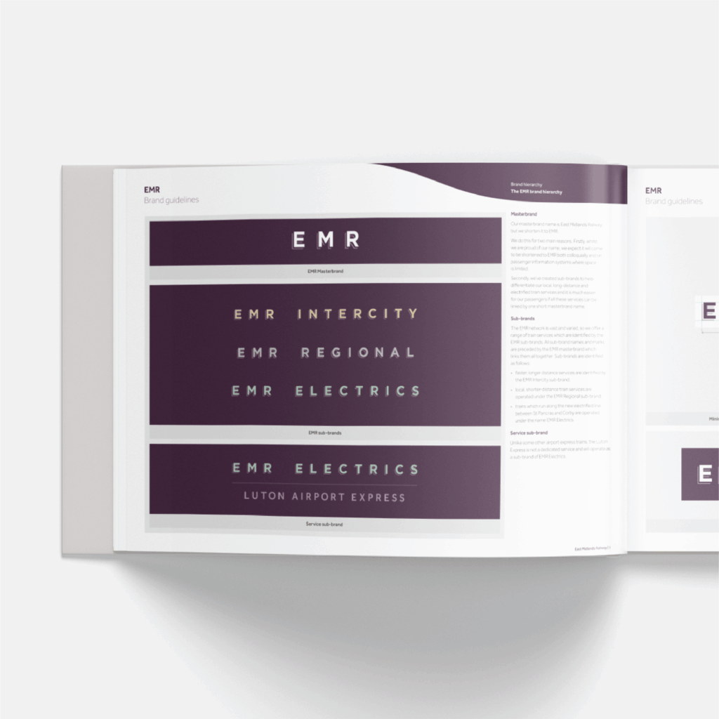
Back in 2019, Abellio was preparing to bid for the East Midlands franchise, taking over from Stagecoach after more than a decade of East Midlands Trains. It was a fast-moving, high-stakes process. Having previously worked with them on Greater Anglia, London Northwestern Railway and West Midlands Railway, they brought us in early to help shape a future-facing brand should their bid succeed. From the outset, the ambition was clear: build something modern, recognisable, and operationally robust, grounded in the heritage of the Midland Railway, but ready to serve a new era of passengers. Led by Tony Howard, whose British Rail experience helped anchor the project, we created a visual identity that spanned rolling stock, stations, uniforms, signage, maps, and digital services. Three concepts were developed; one became the foundation of what we now visually recognise as East Midlands Railway (EMR).
Crucially, design and delivery ran in parallel. With franchise deadlines fixed and the transition window tight, we adopted a phased approach, designing assets quickly, consistently and in tandem, from liveries and uniforms to ticket offices and wayfinding. We developed a comprehensive set of brand guidelines and a bespoke signage system designed to integrate with existing Network Rail infrastructure and typefaces, reducing cost, the need for new products and simplifying the initial rollout.
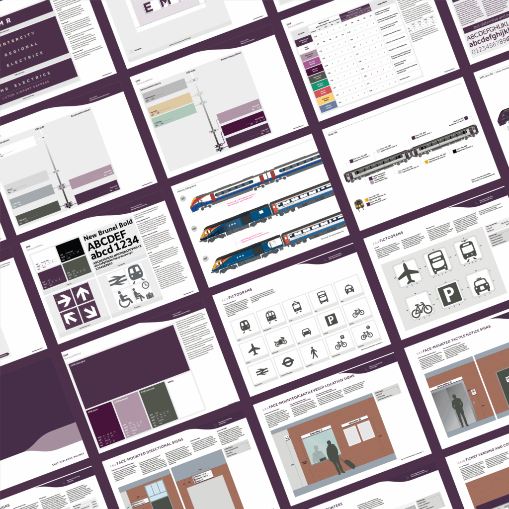
One of the highlights was the wayfinding system: a modular, scalable family of signs and new pictograms built for clarity, accessibility, and as a brand flourish. Every detail from viewing distances and mounting heights to braille and tactile elements was carefully considered and importantly detailed within a comprehensive brand guideline. Bringing it all together in a central reference guide, we helped EMR maintain brand consistency across future upgrades, refurbishments, and service changes.
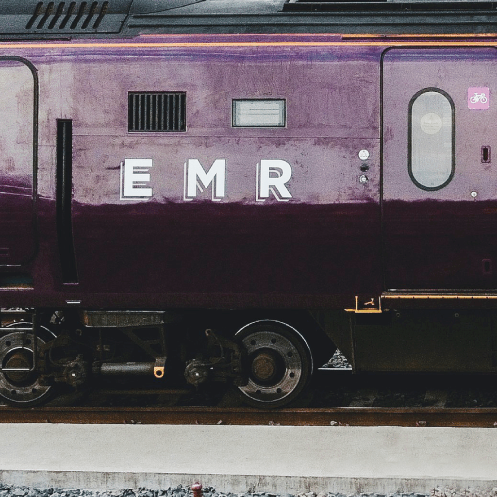
The transition from Stagecoach East Midlands to a unified EMR livery was implemented across all service types, including EMR Connect, Electrics, Intercity, and Regional services with a distinctive purple, chosen for its uniqueness among competitors, paired with a sleek, simple design featuring illustrative elements and clean typography, designed for visibility at speed. This service based identification is more inline with the British Rail identification system of old but this is not what’s anticipated with GBR, which aims to segment the railway network by region. However the visual outcome of this plan remains unclear, will each region share a common design language, or will they adopt entirely distinct identities, and if they do differ, how far removed will that be from the branding landscape we have today?
Since then, we’ve continued to support and collaborate with UK rail operators, including Chiltern Railways, Govia Thameslink Railway, and recently Network Rail, with their development of a brand new wayfinding system, building off and comprehensively stipulating the foundations of the typeface developed by Margaret Calvert and formalising the signage system developed by Nick Job. Our work, now rolling out at stations across the UK, builds on the same principles: clarity, consistency, and respect for the passenger experiences, helping shape the rules and systems that define daily journeys for millions.
As GBR begins to take shape and unravel across the network, one thing is certain: creating a unified national rail identity won’t be simple, quick and uncomplicated and shouldn’t just be about logos or liveries. It will be about infrastructure, wayfinding, legacy, and usability - designed with the public in mind, and built to last.