Beyond the ribbon cutting: What’s next after Melbourne Metro?
Melbourne is having a moment. With the opening of a brand-new, generation-shaping metro system, the Australian city is investing in its transport infrastructure like never before. But it’s not only about the major metro networks; projects like the Greenline are transforming the north bank of the Yarra River into a four-kilometre-long public walkway, with space … Read More
Read More
A lack of integrated tech is holding airports and passengers up
Fresh off a week on the ground at Passenger Terminal Expo, Associate in Australia Geoff Ashmore argues that bringing fragmented data siloes into a single, trusted framework won’t just lift satisfaction scores; it will enable a genuinely seamless journey. Just a decade ago, the word ‘biometrics’ would have struck fear into the average traveller. It … Read More
Read More
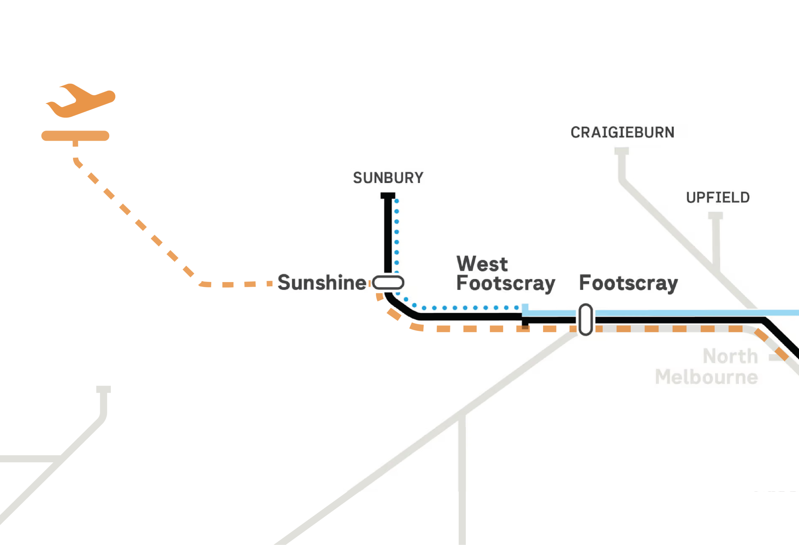
Airport experience starts long before the check-in desk
With a background in urban planning, Director Kate Pleban unpacks one of the top stress points for passengers: the ‘simple’ journey to and from the airport. Walking through inner city Melbourne with my four-year-old niece, she turned to me, puzzled, and asked if we were at the airport. We weren’t, but she pointed down the … Read More
Read More