Stevenage: Looking back to the future
Stevenage Borough Council commissioned Maynard to design a bespoke wayfinding system for its historic Town Centre, supporting the £1bn regeneration programme that will bring the town back to the forefront of modern urban development in the 21st century.
As one of the first steps in a renewal plan that will span over the next 15 years, Stevenage's new wayfinding system offered a rare opportunity to set the tone and principles of what is to come.
Whilst the system typology covered typical product and graphic elements, from map-based wayfinding totems to intuitive fingerposts, the team soon realised that the town's rich heritage meant there was potential to go beyond that. The system needed to respond to people's aspirations for their hometown, as well as embrace its origins and traditions. This meant supporting the revitalisation of the Town Centre as a destination in its own right — celebrating the town's pioneer legacy and identity, whilst leaving enough space to grow as the regeneration evolves.
On our quest to uncover Stevenage's rich background, the team worked in close collaboration with the town council and local museum, who helped us navigate through its rich and unique history.
Born as a radical response to London's post-war housing crisis, Stevenage’s ‘New Town’ development was met with a sense of utopian optimism and a resurgence of social and community values.
The New Town is recognised as being the first pedestrianised Town Centre in the country. It adopted an innovative system of segregated cycleways for its time, and it had the foresight to introduce a wealth of celebrated public art across its urban landscape for communities to enjoy. This ambitious vision helped to create a distinct sense of place that remains to this day.
That's the spirit we wanted to capture and the story we wanted to tell. Design became a tool not to add, but to make visible what was already there.

The identity
Through colour, texture, typography, motifs, sculptures and architecture, we were able to capture a snapshot of the community's identity from its material culture. The process started at the very heart of Stevenage, with the iconic Grade II listed, modernist inspired clock tower, expanding outwards to create a graphic reconstruction of the town.
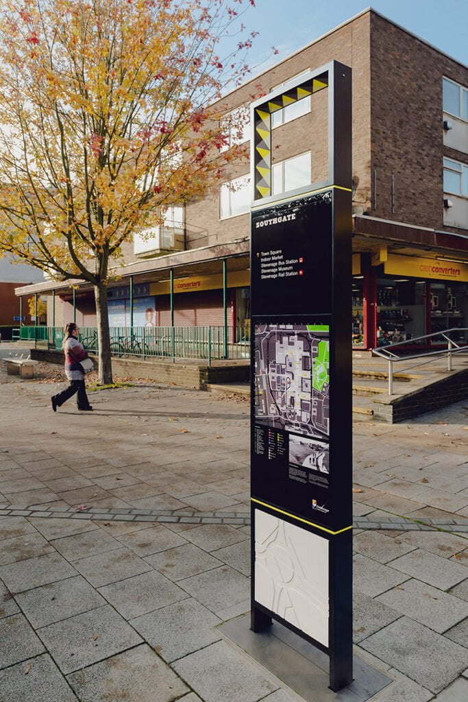
Both our product range and graphic elements drew inspiration from the clock tower with its Dutch palette and Mondrian's strict grids — our ultimate barometer for the town's visual language. Its framing quality has been transposed to the totems, with a square window lined with decorative yellow tiles. Each totem was then strategically placed at key locations where they would not only support navigation but also frame the vistas which were so important to the original vision of the New Town’s planners.
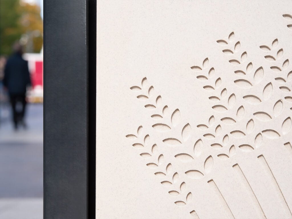
Stevenage's wealth of public art begins in its main square but extends much further beyond. Populated by an eclectic public collection, from sculptures to intricate murals, these pieces of narrative were incorporated into the main totems themselves, traced and engraved into modern concrete panels, acting as cues to the town's history.
Lastly, a key design requirement for the product range was its ease of relocation and updatability as the regeneration of the area progresses and its identity evolves. The result is a versatile and modular totem which enabled graphics to be cost-effectively updated and replaced as and when needed.
The typeface
Further research involved identifying the main typefaces used across the New Town’s original buildings and storefronts, searching for one that could feature prominently in the new wayfinding system. And there it was, bold and charismatic, giving the name to the local market. A typeface that embodied the spirit of the community we wanted to reflect. A typeface with a certain Stevenege-ness that had since been slowly disappearing from view.
Using what little was left from old signage, we worked to resurrect the historical typeface that later informed the development of a unique set of pictograms. Thorough archive research served as the base for the typeface studies, informing and defining the individual characters. Our main intention was to keep the original type design to honour the city's visual identity, whilst seizing the opportunity to be bolder with the glyphs that we had no precedents for.
The creation of a bespoke typeface allowed the regeneration process to extend beyond the town's physical boundaries, whilst strengthening its individual sense of place. It allowed each citizen to own and cherish a piece of the old and new Stevenage.

Mapping the town
Whilst art plays a major role in Stevenage's character, the New Town's planners' efforts to foster a neighborhood feel and create safe public environments are equally defining. This ambition struck a chord with our designers and we were keen to continue their legacy by developing a mapping strategy that promoted healthier minds and bodies.
Our challenge was to celebrate the town’s brutalist iconic architecture whilst highlighting its public green and leisure spaces. A carefully selected colour palette for the town's parks allows it to stand out, inviting both locals and visitors to enjoy the outdoors. The mapping's visual identity also took inspiration from the existing clock tower murals, with its monochromatic tones, geometric shapes, and organic lines. We took this dichotomy and introduced it in the new map as textures, strict lines for the pedestrianised areas, highlighting key destinations, and organic ones for the green spaces.
A city for all
On our mission to champion culture and wellbeing, we populated the maps with informative, engaging and inclusive content. Inspiring public art trails were supported with convenient resting points and accessible routes, clearly marked out through intuitive pictograms and friendly illustrations. The New Town’s revolutionary cycle network also played center stage. Its smooth, safe and connected cycleways were highlighted as one of the map’s main features, through a vibrant splash of colour, to emphasise the importance of active travel within the regeneration scheme.
Stevenage presented a fascinating challenge with its pioneering past. We wanted to respect its history and context, whilst empowering and celebrating the irreverence and innovative spirit of its people. We wanted to keep pushing forward as they have hitherto. The result does exactly that. It brings this community together through a common narrative, enhancing the voice of this historic site and its public realm, and setting the tone for what is to come.

Words by Ana Henriques, Designer
Photography by Ruth Ward